I led the end-to-end branding and UX/UI strategy, ensuring consistency across Volcom’s website, campaign pages, and product pages.
ROLES
UX/UI Strategy, Digital Art Direction
TOOLS
Figma, Adobe Creative Suite (Photoshop, Illustrator), Shopify CMS
DELIVERABLES
Component-Based Design System, Shopify CMS Implementation
The Challenge
Volcom needed a scalable, cohesive digital design system that balanced brand expression, accessibility (ADA compliance), and SEO optimization while maintaining its rebellious, punk-rock identity. The challenge was to modernize Volcom’s online presence without diluting its core aesthetic.
Discovery & Research
Understanding the Brand & Users
Volcom’s audience consists of core action sports enthusiasts, parents (moms and dads) who have previously or currently identified with the lifestyle and shop for themselves or their kids, and 18-25-year-olds who align with the brand’s rebellious, free-spirited identity.
With this diverse audience in mind, I structured the digital branding system around key behavioral insights:
Users expect an edgy, high-energy experience
Research from industry competitors (e.g., Vans, Burton, social media and informal interview feedback) revealed that brand attitude and aesthetic strongly influence engagement. The design needed to maintain Volcom’s rebellious, punk-rock identity while remaining accessible and engaging for all audience segments.
SEO & Accessibility must work in harmony with design
Industry best practices emphasize that live text, scalable typography, and ADA compliance directly impact both usability and performance. Ensuring accessibility without compromising Volcom’s bold visual identity was essential.
Scalability is key for long-term efficiency
A component-based design system allows for faster execution across multiple campaigns and product launches, ensuring consistency while adapting to evolving brand needs.
Competitive Benchmarking
I analyzed digital branding strategies from competitors (Burton, Patagonia, and RVCA) to identify gaps in Volcom’s digital presence.
Key findings:
✅ SEO & ADA best practices were underutilized in Volcom’s existing design system.
✅ A modular approach would improve consistency across product launches.
✅ Typography & imagery needed refinement to better balance aesthetics with usability.
UX Strategy & Design Process
To make Volcom’s digital branding more scalable and flexible, I applied Brad Frost’s Atomic Design principles, breaking UI elements into:
- Atoms → Buttons, typography, icons, colors
- Molecules → Lists, forms, cards
- Organisms → Navigations, filters, product sections, carousels
- High-Fidelity Design → Homepage, Product Landing Page, Product Detail Page, Prototypes
✅ Outcome: This approach allowed for fast iteration and brand consistency.
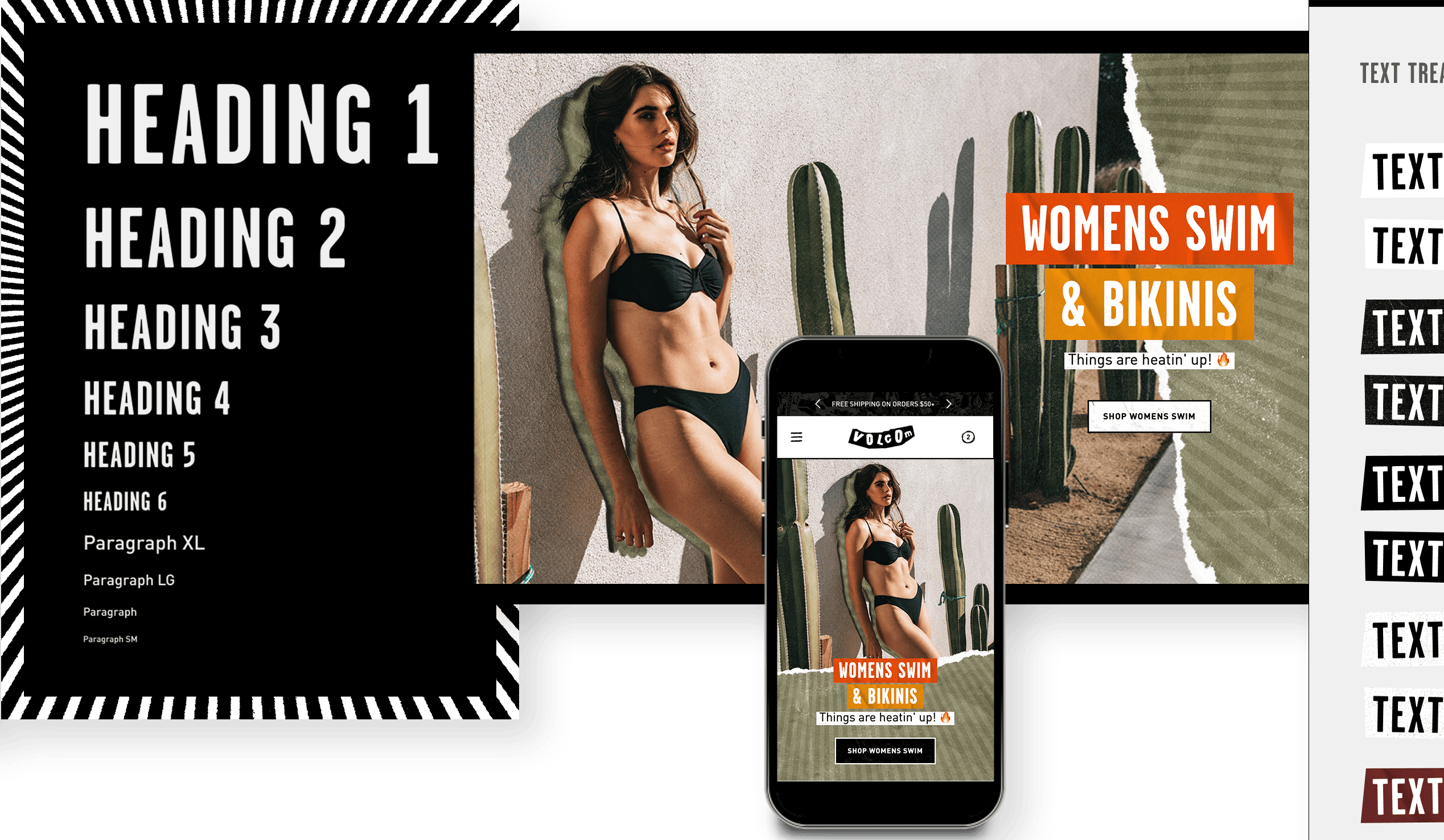
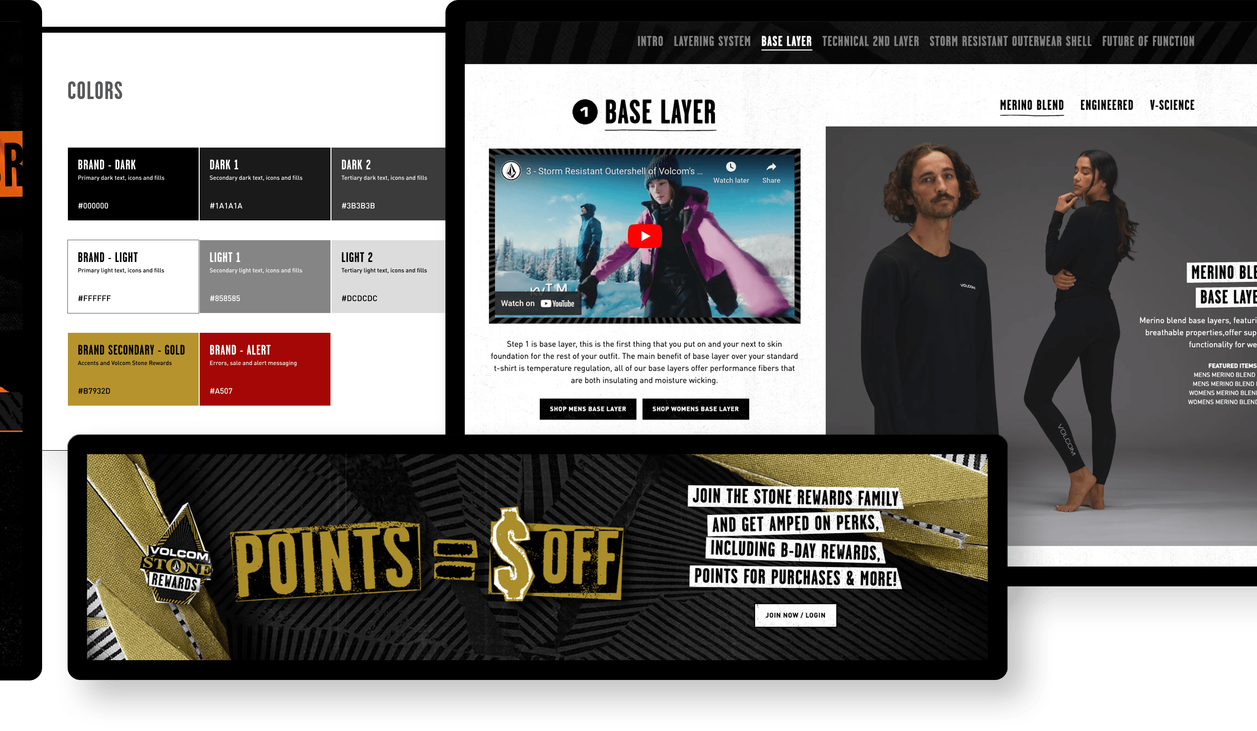
1. Atoms
The fundamental components of our interfaces, act as the basic building blocks for all user interface elements.
Included icons, buttons, type styles, inputs, controls, the color palette & more.
Utilizing Figma’s variables, I created a spacing scale closely aligned with the Perfect Fourth (1.333) ratio, ensuring consistency with the typographic scale.
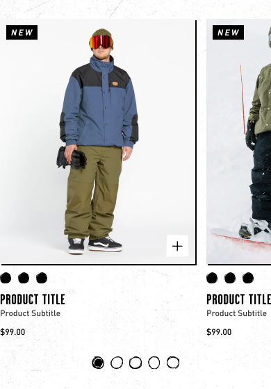
2. Molecules
Molecules are small clusters of related UI elements that work together to perform a specific function.
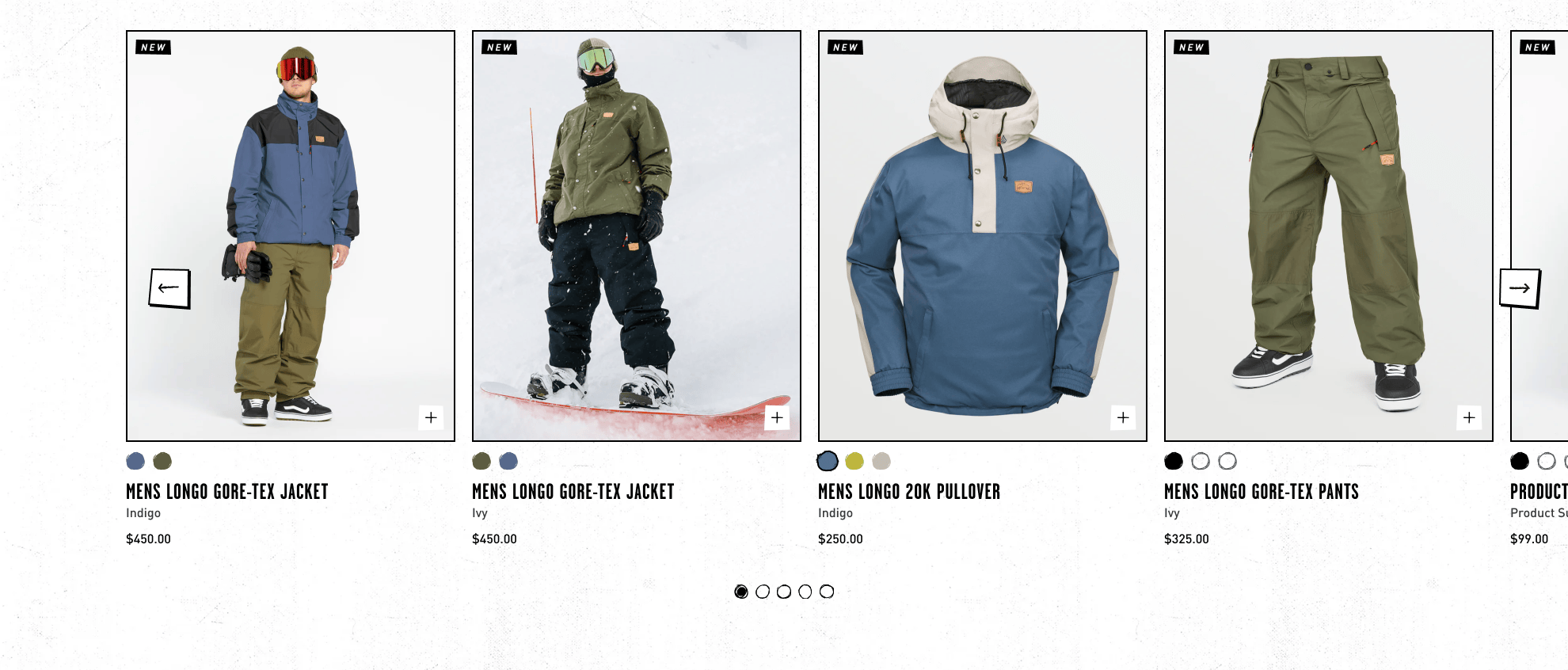
Example components included product image hover states, universally used content sections, lists, and cards.
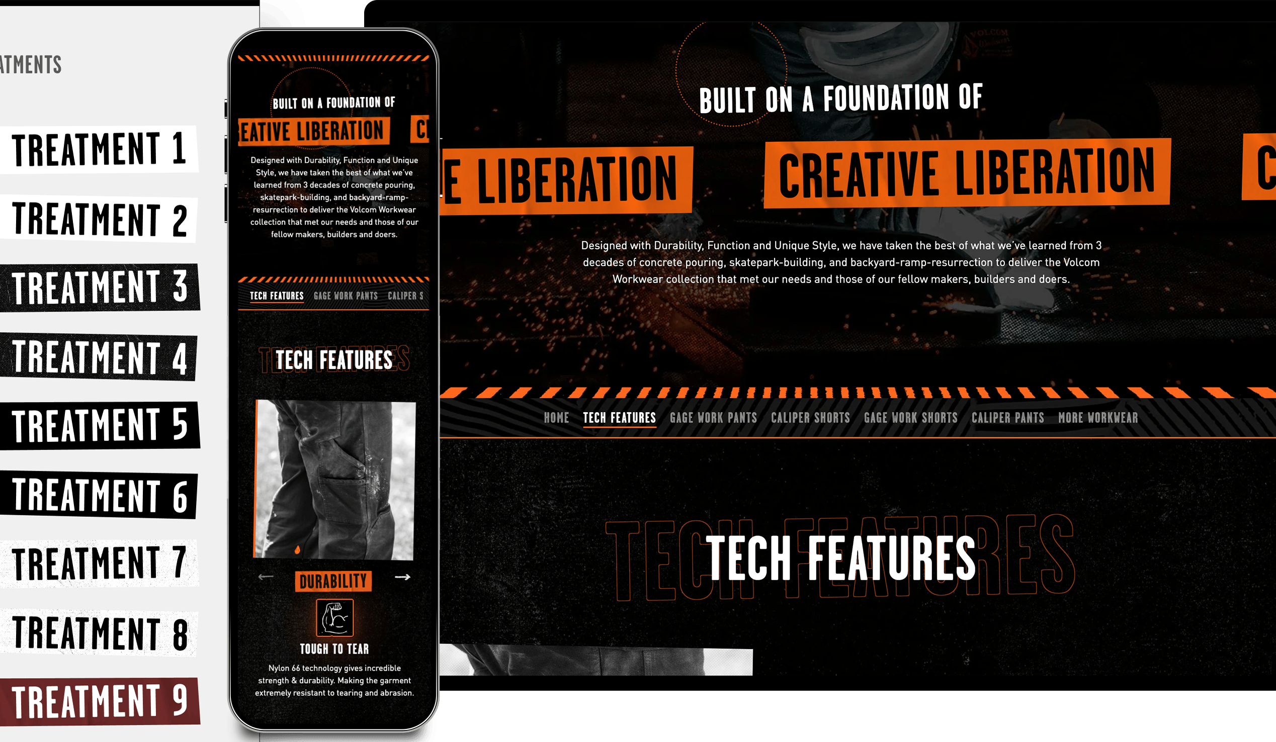
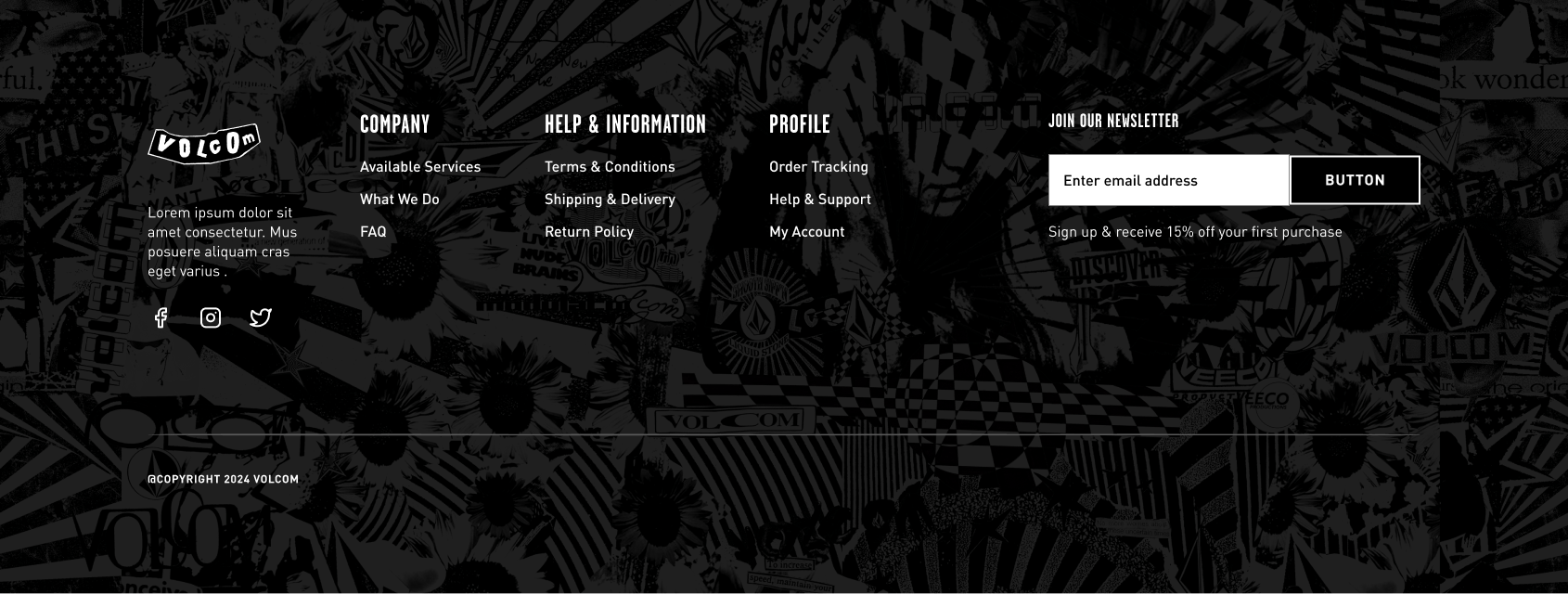
3. Organisms
Larger functional groupings of components that create cohesive UI sections.
Includes menu styling, product carousels, cart drawer, filter list, and product grid.
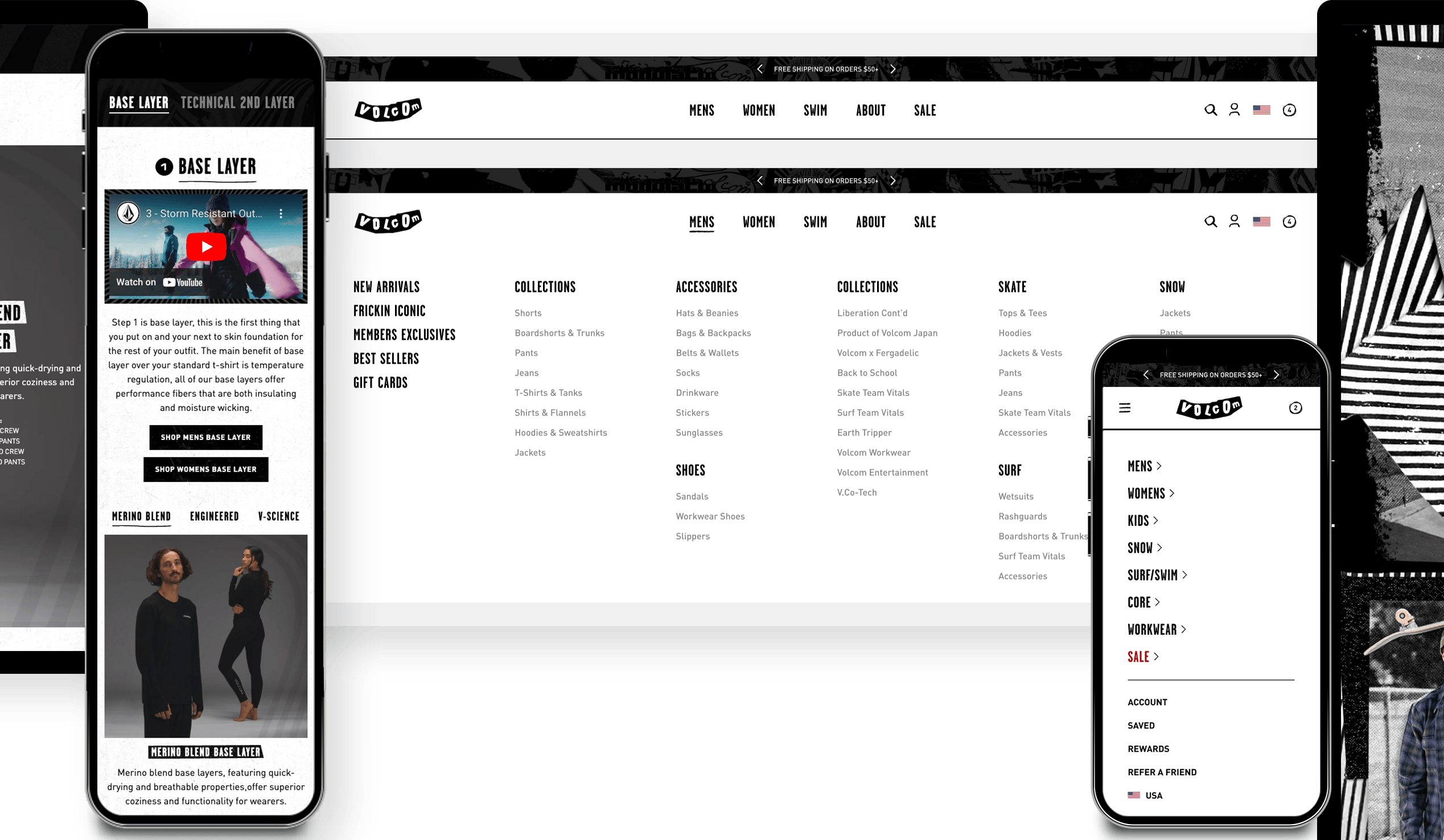
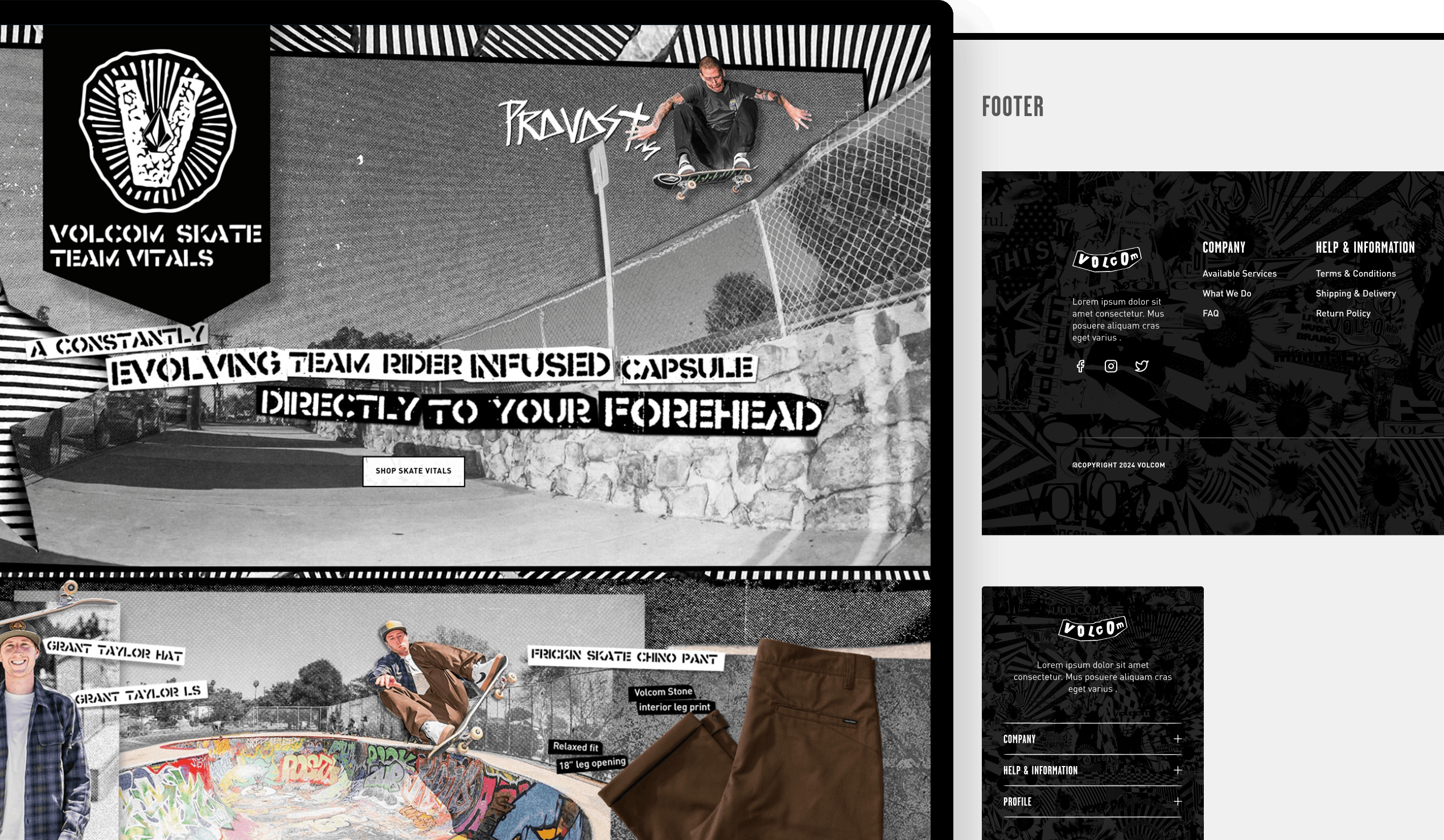
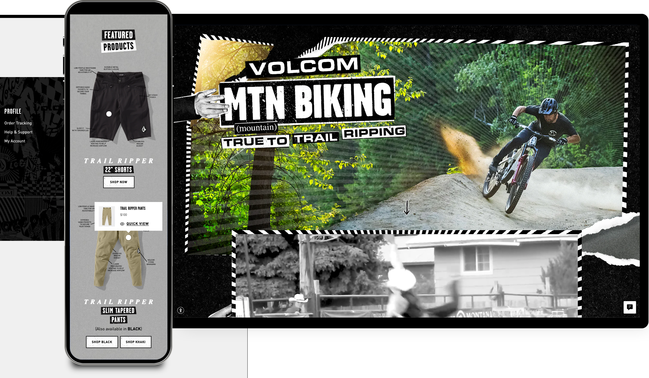
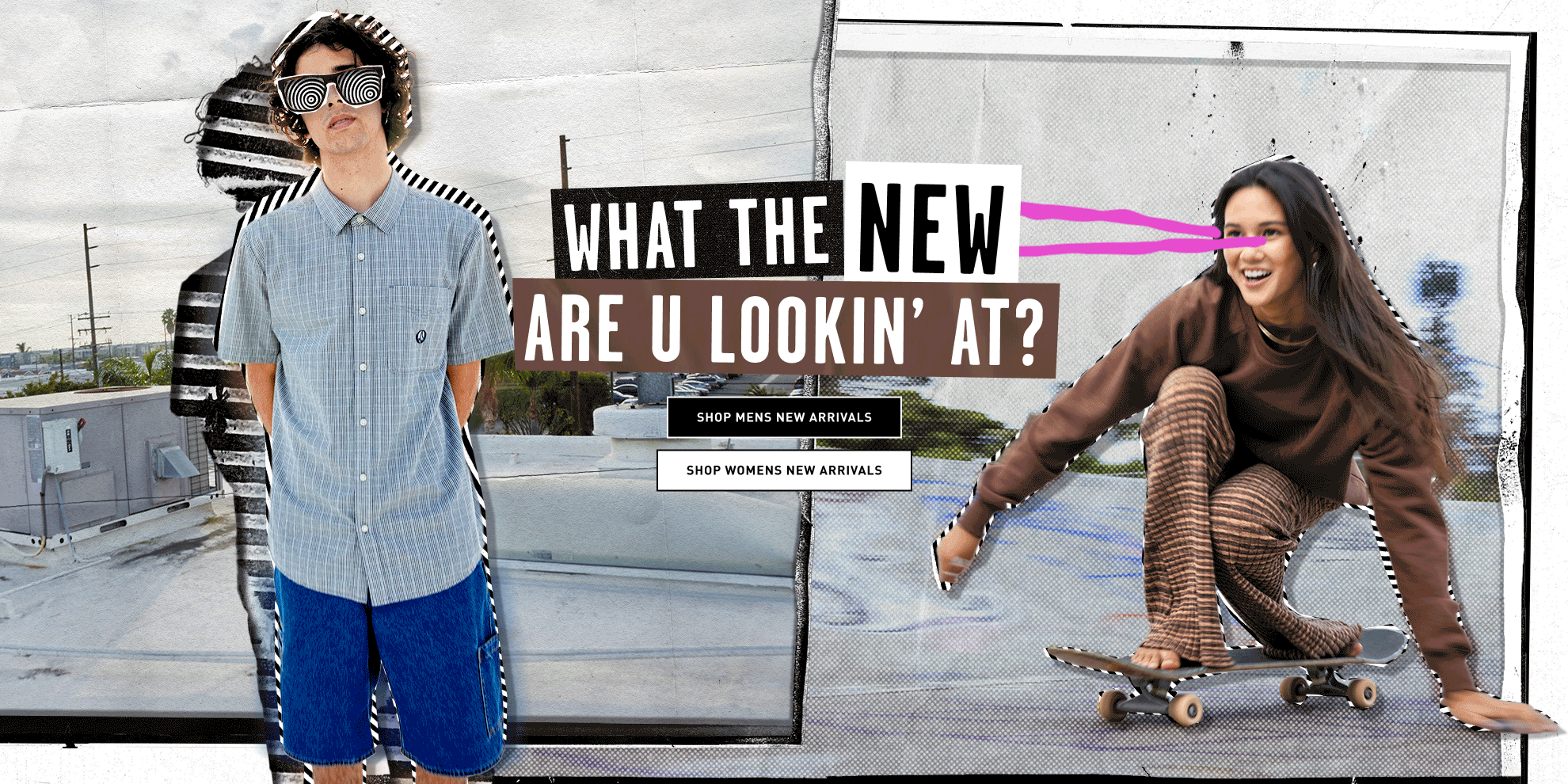
4. High-Fidelity Design
At this stage, high-fidelity wireframes and prototypes bring the design to life, showcasing the final structure, interactions, and visual details before development.
Typography Solutions
✅ I optimized typography for live text (instead of image-based text) and refined high-contrast layouts, maintaining Volcom’s edge while improving ADA compliance.
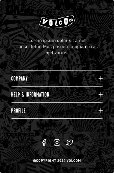
Responsive Homepage Design
✅ Developed a fully responsive homepage template using a modular Shopify CMS system, reducing development bottlenecks while ensuring SEO optimization and ADA compliance.


Product Landing Page → Product Detail Page Prototype
✅ Prototyped a seamless shopping experience, allowing users to effortlessly navigate from the product landing page to quick-add to cart or explore the product detail page, with a sticky buy box that remains accessible until all images are scrolled through, ensuring a smooth purchasing flow.
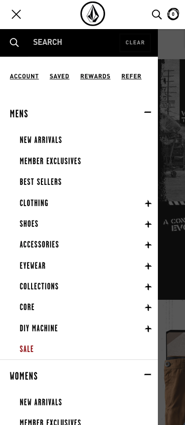
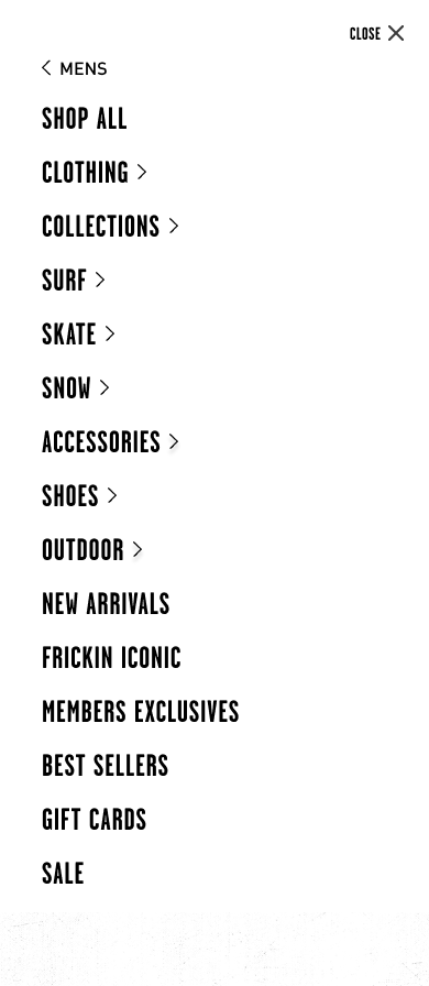
Mobile Navigation Menu Solution
✅ Implemented a ‘panel’ style navigation, where each category transitions into its own screen, offering larger, more clickable typography and increased real estate for better usability.
Before & After
Results & Reflections
While we didn’t have direct user testing data, Google Analytics post-launch insights indicated:
✅ Faster content deployment (CMS system reduced design/development workload).
✅ Improved engagement through high-impact storytelling & refined UX flow (decreased drop-off rates and increased conversion rates).
✅ SEO-optimized design leading to increased organic discoverability.
Opportunities for future improvements:
- Conduct usability testing with session recordings to analyze user behavior and identify friction points.
- Implement heatmap tracking (Lucky Orange or Hotjar) to analyze user interactions.
- Integrate user surveys within the flow to gather insights on drop-off points.
- Explore A/B testing for optimizing conversion paths.

This project was a game-changer for Volcom’s digital branding—merging its punk-rock aesthetic with UX best practices. By applying Atomic Design principles and Shopify CMS optimizations, I helped build a scalable, high-performing digital experience that stays true to Volcom’s DNA while being future-proof.