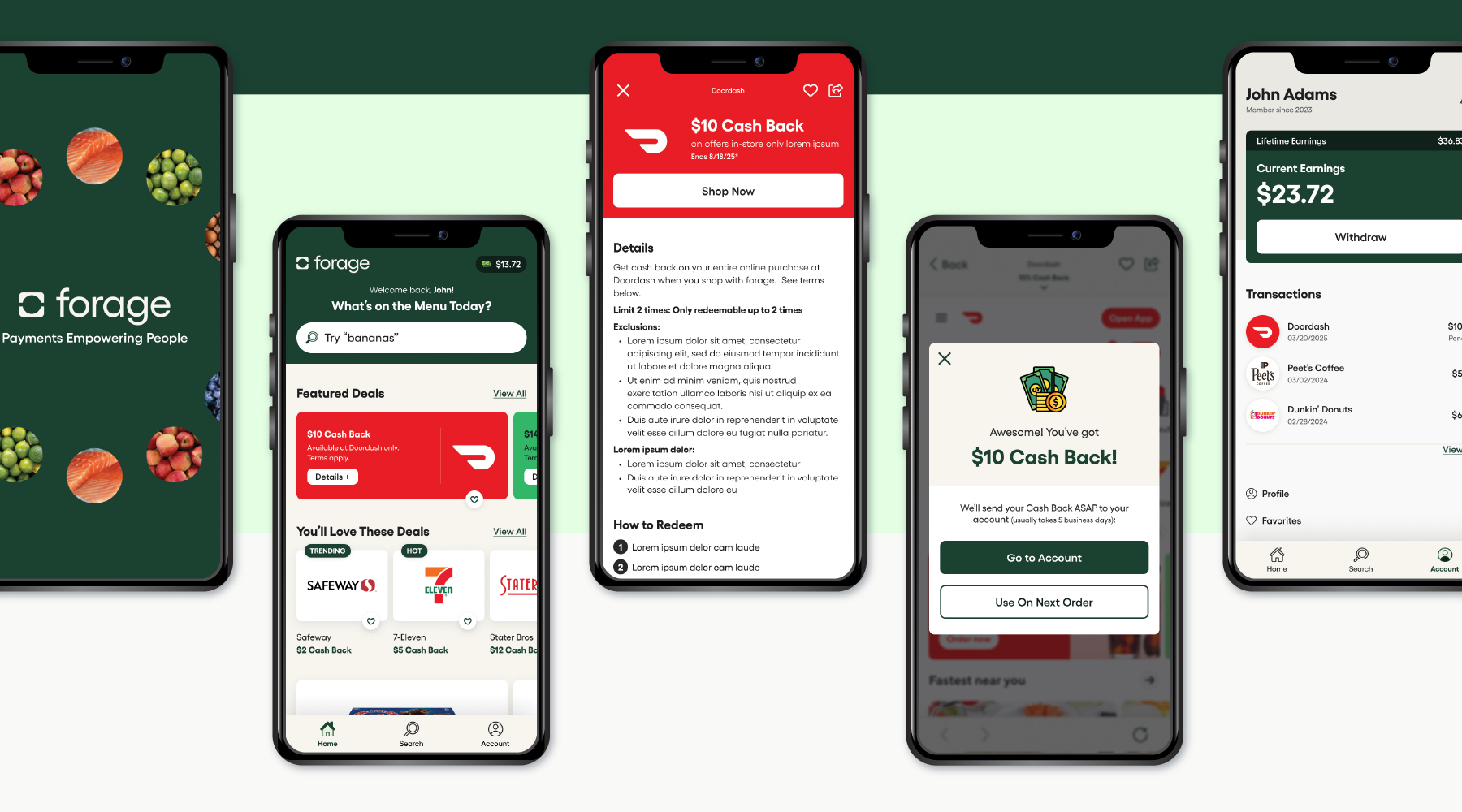
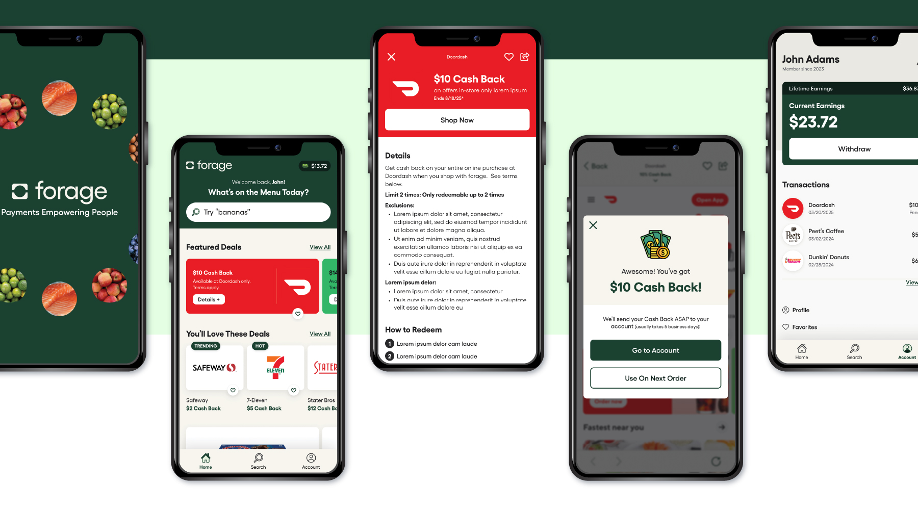
Forage Mobile App
A concept app designed for budget-conscious grocery shoppers looking to save money through seamless cash back offers.
ROLES
UX/UI Design, Information Architecture, User Research
DELIVERABLES
Mobile app design concept
TOOLS
Figma, Miro, Adobe Illustrator
Discovery
Forage is a payments company that helps merchants accept government benefits like EBT SNAP and EBT Cash, enabling 42 million Americans to spend their benefits online and in-store.
The Problem
Grocery shoppers often miss out on savings due to confusing cash back offers, unclear eligibility, and slow redemption timelines. Brands, meanwhile, struggle to drive offer engagement and repeat purchases.
The Solution
Create a seamless, intuitive cash back mobile app experience that makes it easy for users to find, activate, and redeem rewards while helping brands increase engagement and order value.
Research & Insights
Objective
To evaluate how other apps in the grocery savings and cash back space handle in-app experience, cash balance visibility, and offer/rewards clarity.
Criteria Assessed:
- Full In-App Experience – Can users browse, activate, redeem, and track rewards without leaving the app?
- Visible Cash Balance – Is the user’s earnings or rewards balance always visible or easily accessible?
- Dedicated Rewards Detail Screen – Is there a clear screen to view and understand offer/reward terms?

Key Findings
Only Ibotta offered all three core features—but its user experience was cluttered and lacked visual hierarchy, making it hard to digest content and navigate offers efficiently.
Design Opportunity
There’s a clear opportunity to build a more visually streamlined, content-prioritized, and user-friendly cash back experience that keeps everything in-app, makes rewards clear, and minimizes cognitive overload.
User Needs
- Find & Activate Cash Back Offers Easily
- Transparency on Offer Terms
- Know When Cash Back is Earned & Available
- Fast & Flexible Redemption
- Save More Money Without Changing Shopping Habits
Business Goals
- Increase Offer Activation & Conversions
- Drive Repeat Engagement
- Encourage Higher Spend Per Order
- Enhance Partner Visibility
- Improve Cash Back Redemption Rate
User personas
- Maria: A 29-year-old single mother new to using EBT online, seeking a simple, guided experience
- John: A 45-year-old disabled veteran who relies on EBT for frequent grocery deliveries, prioritizing efficiency and a seamless checkout experience
- Linda: A 60-year-old using EBT at farmers’ markets, she values local food but needs a user-friendly, senior-accessible app
Ideation
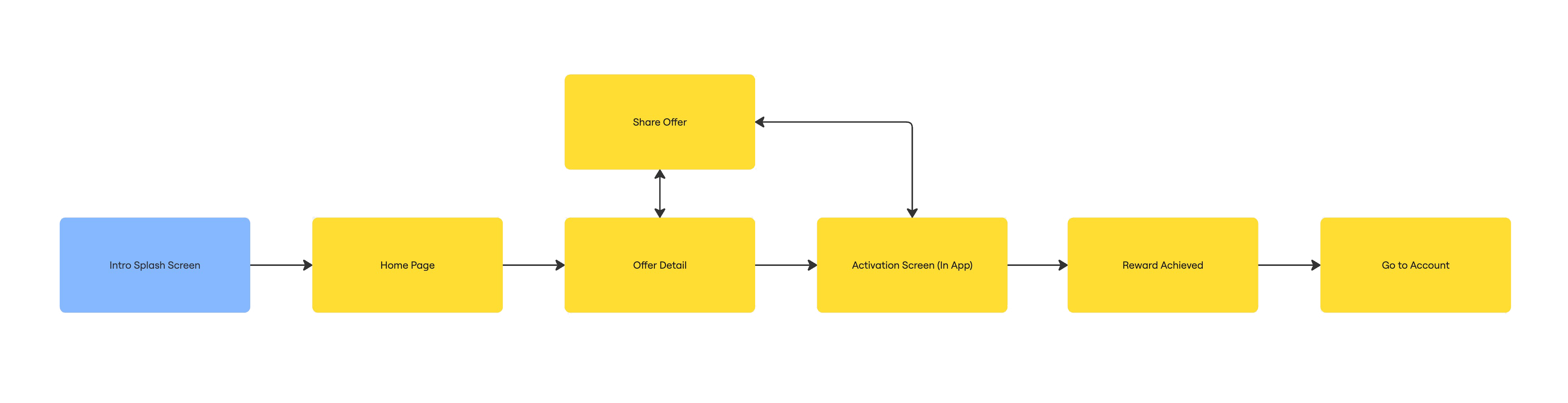
Task Flow
From launching the app to activating a cash back offer, completing a qualifying purchase, and viewing earned rewards in the user’s account.
Lo-fi Wireframes
To better understand the visual hierarchy and essential elements, I created hand-sketched wireframes outlining the must-haves for each screen.

UI Kit
I created a UI kit to translate the brand identity into a cohesive high-fidelity design system.

Prototype
Results & Reflections
Projected Results
- Reduced friction in offer activation → 1–2 tap flow encourages more engagement
- Clearer offer detail screens → Decreased user drop-off before redemption
- Real-time cash back tracking → Builds trust and increases return visits
- “Use on next order” CTA → Encourages repeat purchases and keeps cash back in-app
- Improved visual hierarchy vs. competitors → Easier to navigate than cluttered alternatives like Ibotta
Learnings
- How to align user needs with business goals for mutual benefit
- The importance of visual hierarchy when designing content-heavy experiences
- That reward-based systems need to balance simplicity, trust, and delight to keep users engaged
Future Considerations (if real)
- Conduct usability testing on the redemption and wallet flows
- Iterate based on real user feedback
- Explore support for EBT users or other financial accessibility features
- Expand the prototype into a full design system with motion and microinteractions
Through this concept, I set out to simplify something that often feels unnecessarily complicated—earning rewards. I’m excited by the potential of this app to make everyday savings feel seamless, rewarding, and actually worth using