Volcom UI/UX & Brand
In just 1.5 months, I delivered Volcom’s first scalable Atomic Design + Shopify CMS system — modernizing its punk-rock identity while improving accessibility, usability, and conversion.
ROLES
UX/UI Strategy, Digital Art Direction, Conversion Optimization
TOOLS
Figma, Photoshop, Illustrator, Shopify CMS, GA4
DELIVERABLES
Scalable Design System, Prototypes, CMS Setup, Conversion Features
The Challenge
Volcom is a global action sports brand known for its rebellious, punk-rock ethos — but its digital experience hadn’t kept pace, lacking modern optimization, usability, accessibility, and scalability practices.
Pain Points:
- No design system → inconsistent execution across campaigns.
- Baked-in text/CTAs → poor SEO and ADA compliance.
- Usability issues → small tap targets, confusing mobile nav, low homepage engagement.
- Outdated shopping experience → no modern conversion tools like Quick Add or hotspots.
⚡ Constraint: I had just 1.5 months to deliver a full transformation, requiring scalable solutions and high-impact features that could launch quickly without sacrificing brand expression.
Goals
- Modernize the online experience while preserving Volcom’s punk-rock identity.
- Simplify the journey from discovery to checkout.
- Drive growth in conversion, AOV, and overall demand.
- Build within Shopify CMS so merchandisers could manage and scale campaigns independently.
Discovery & Research
Core and Target Audience:
- Volcom serves hardcore action sports enthusiasts (18–25), casual participants across Gen Z–Gen X, and youth drawn to its rebellious ethos.
Behavioral Data (GA4 + User Feedback):
- Homepage scroll depth: Users rarely reached the bottom → key content surfaced higher.
- Hero banners: Video consistently outperformed static → prioritized motion-first assets.
- Navigation: Informal interviews revealed small tap targets + confusing hierarchy → redesign required.
- PLP to PDP friction: Users disliked toggling between PLPs and PDPs just to see more photos or add to cart → highlighted need for Quick Add, color swatches, and sticky buy box.
- Informal user interviews, customer service insights, cross-functional team feedback, and market research revealed that while users expect edgy, high-energy experiences consistent with the brand, they also demand usability and clarity.
- "I couldn't figure out how to use the mobile navigation, I got frustrated and ended up leaving the site."
- "SEO flagged that baked-in text isn’t crawlable, so our content isn’t ranking the way it should."
- "Every time we need to update text in these images, it requires a designer and developer, which slows us down."
Competitive Benchmarking:
- Reviewed Burton, Patagonia, RVCA.
- Found underutilization of SEO + ADA best practices.
- Identified opportunity for a modular design system to improve consistency and scalability.
Atomic Design System
With just 1.5 months to deliver, I applied Brad Frost’s Atomic Design principles to ensure speed, scalability, and consistency.
- Atoms → Buttons, icons, typography, colors
- Molecules → Cards, lists, forms
- Organisms → Navigation, filters, product sections, carousels
- Templates/Pages → Homepage, PLP, PDP, prototypes
Outcome:
- Enabled fast iteration and reduced design debt.
- Delivered a reusable system across campaigns.
- Preserved Volcom’s punk-rock identity while improving accessibility and usability.
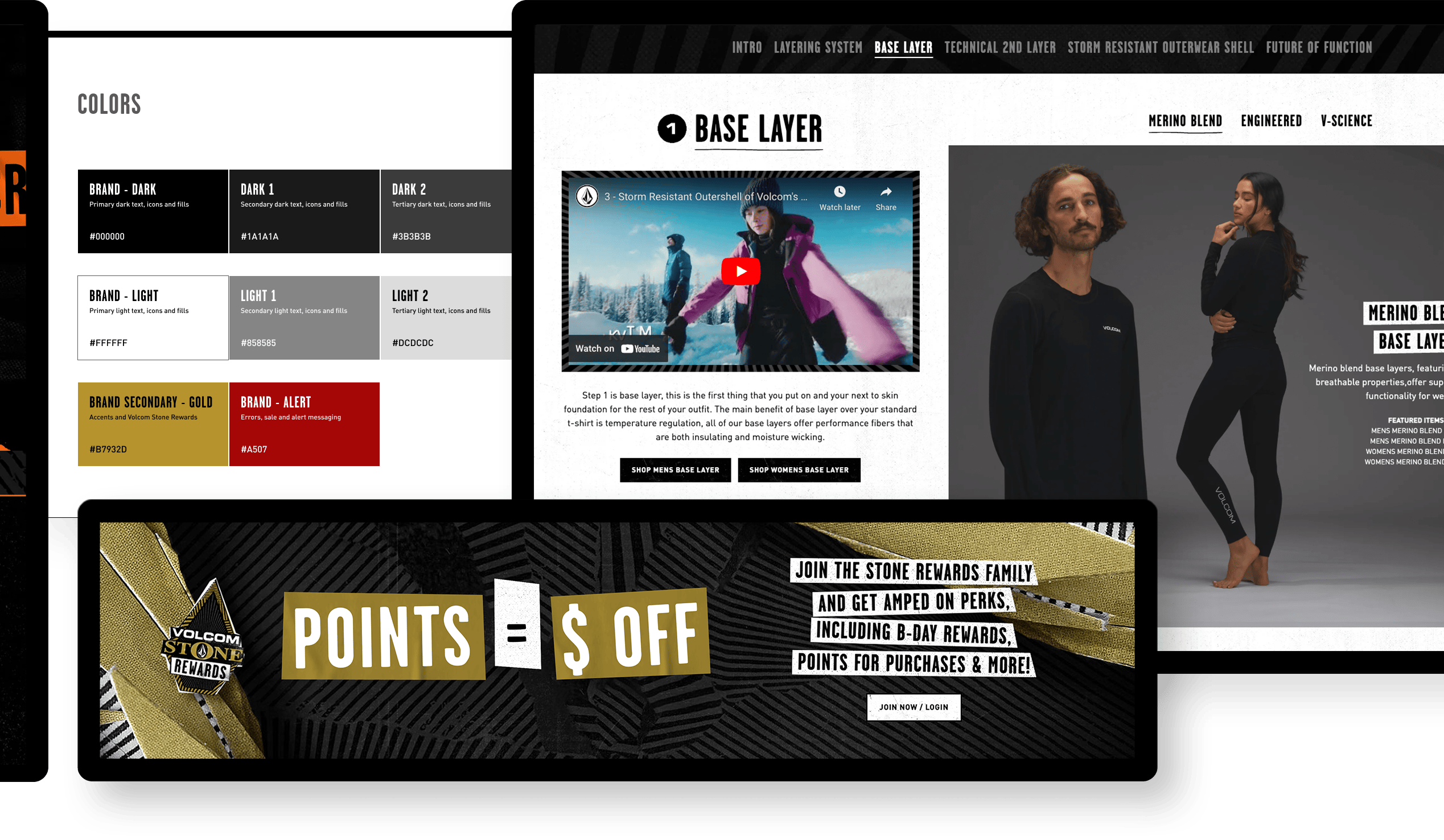
1. Atoms
The fundamental components of our interfaces, act as the basic building blocks for all user interface elements.
Included icons, buttons, type styles, inputs, controls, the color palette & more.
2. Molecules
Molecules are small clusters of related UI elements that work together to perform a specific function.
Example components included product image hover states, universally used content sections, lists, and cards.
3. Organisms
Larger functional groupings of components that create cohesive UI sections.
Includes menu styling, product carousels, cart drawer, filter list, and product grid.
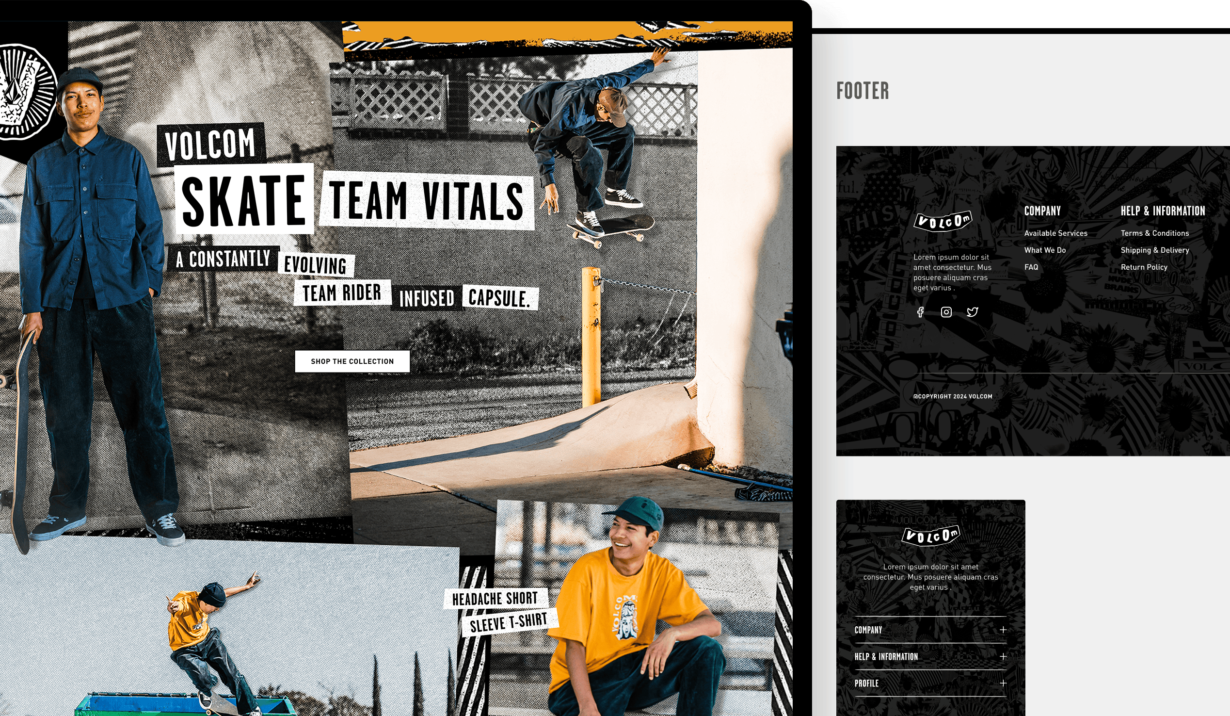
UX Strategy & Design Process
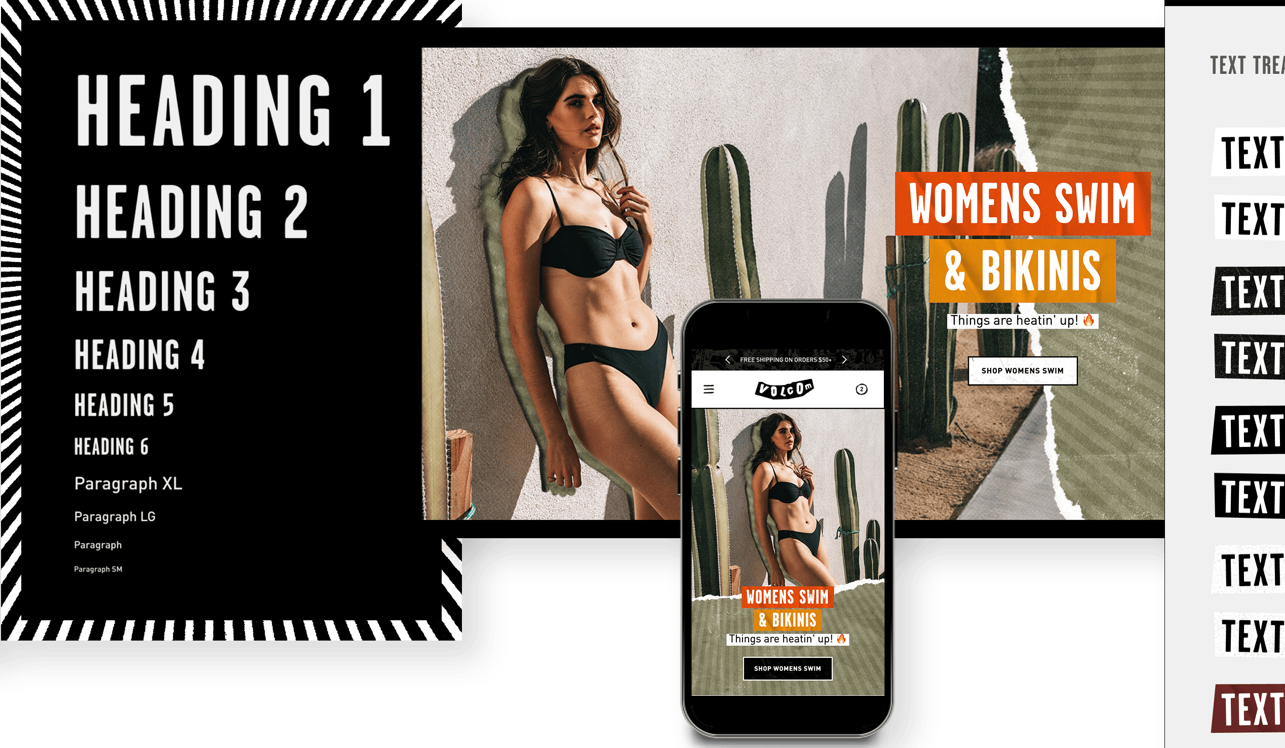
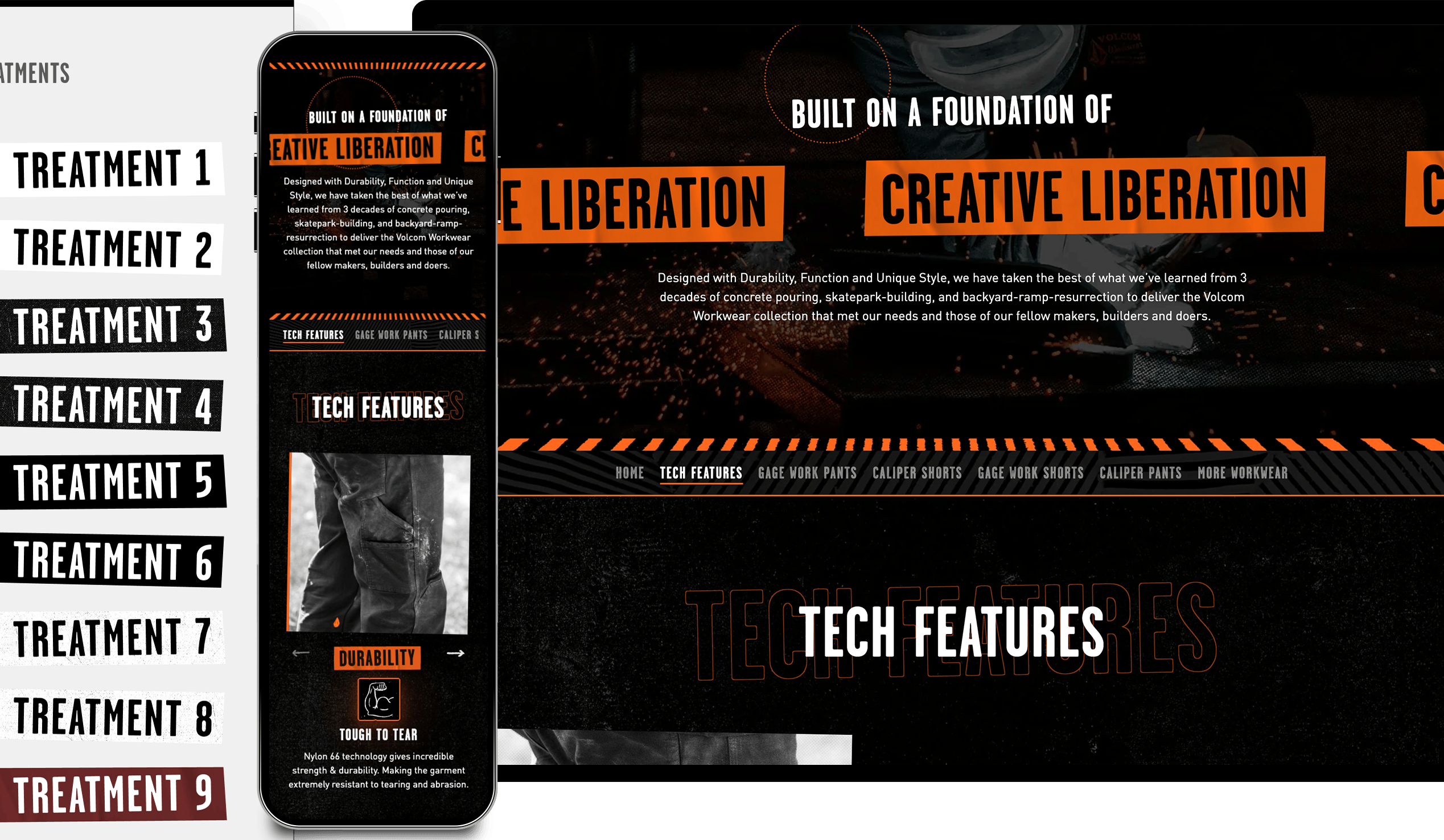
Live-Text Solutions
To improve accessibility and SEO without diluting Volcom’s punk-rock aesthetic, I delivered scalable live-text solutions within the design system.
- Live Text: Replaced image-based text with live text → improved SEO indexing + ADA compliance.
- High-Contrast Typography: Preserved Volcom’s edgy look while improving accessibility.
- CMS Flexibility & Scalability: Merchandisers select textures, cutouts, angles, and colors via dropdowns → flexible campaigns that remain consistent and on-brand.
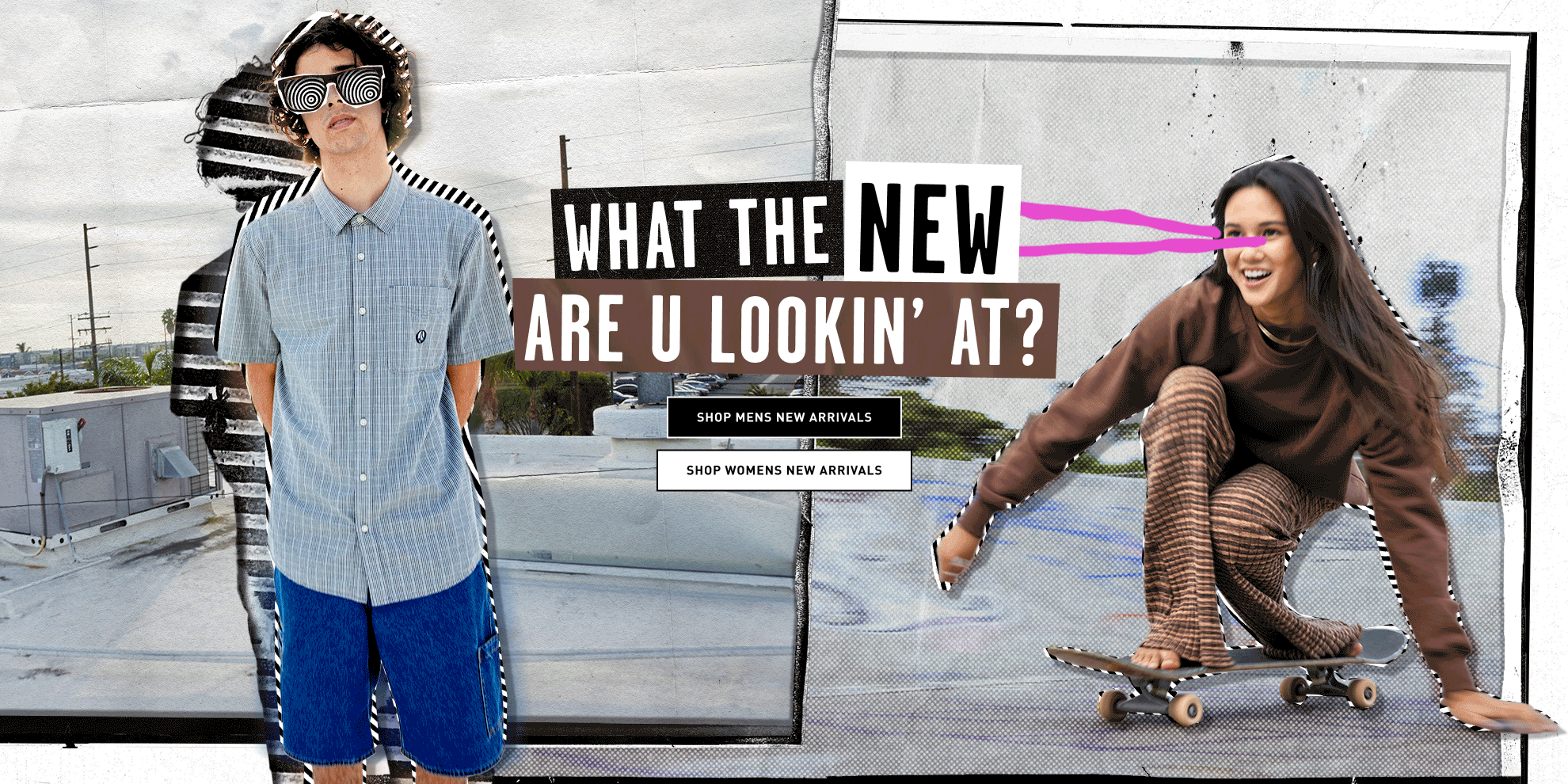
Homepage Strategy
GA4 data and user feedback informed key changes to the homepage layout, content hierarchy, and hero treatment.
- Scroll Depth (GA4): Users rarely reached the bottom → shortened layouts and moved key content higher.
- Hero Banners: Video consistently outperformed static → prioritized motion-first assets.
- Conversion Features: Hotspots and quick add-to-cart → streamlined discovery-to-checkout, boosting engagement, conversion, and AOV.


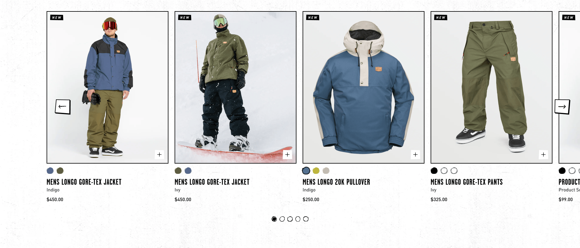


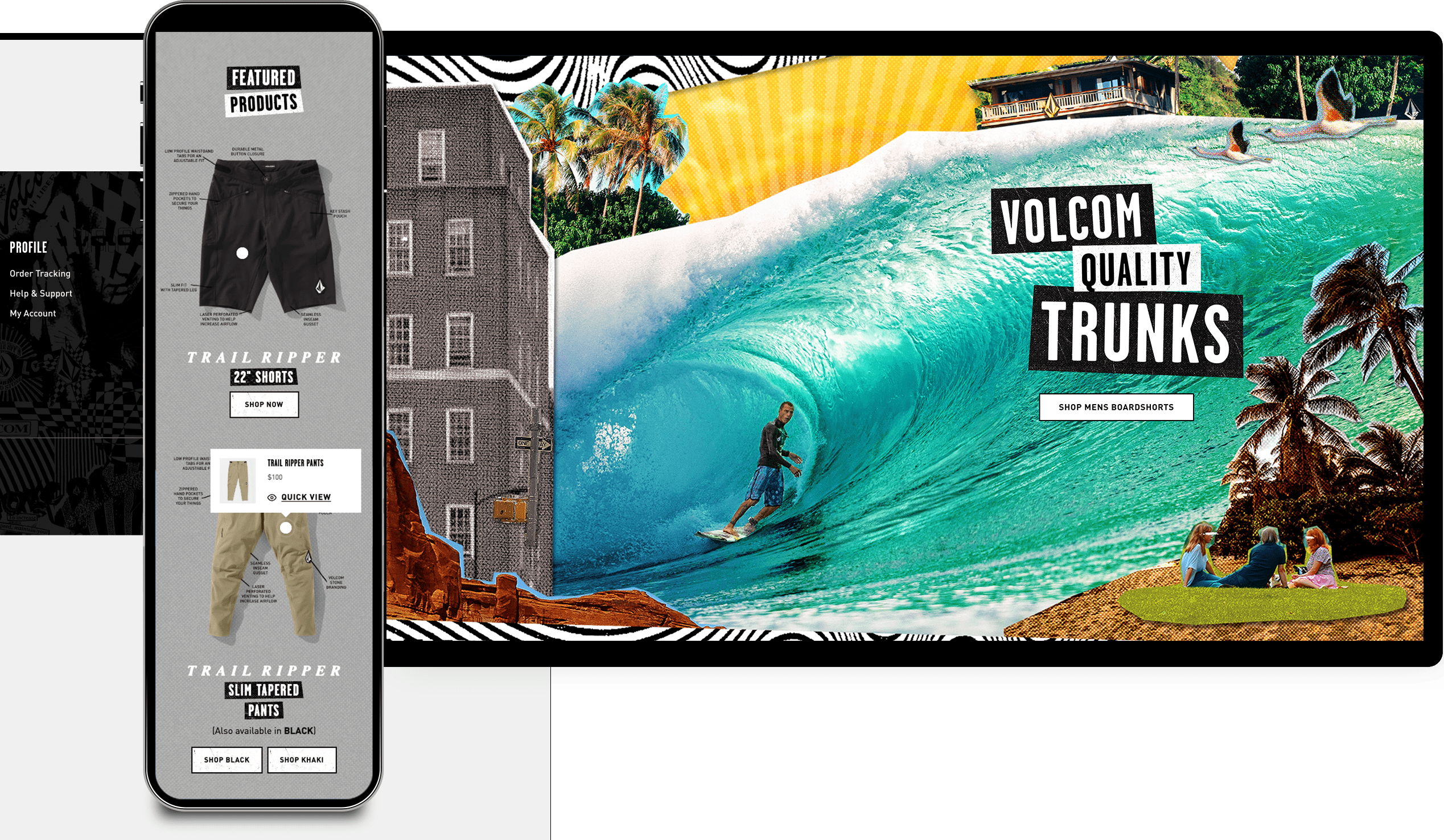
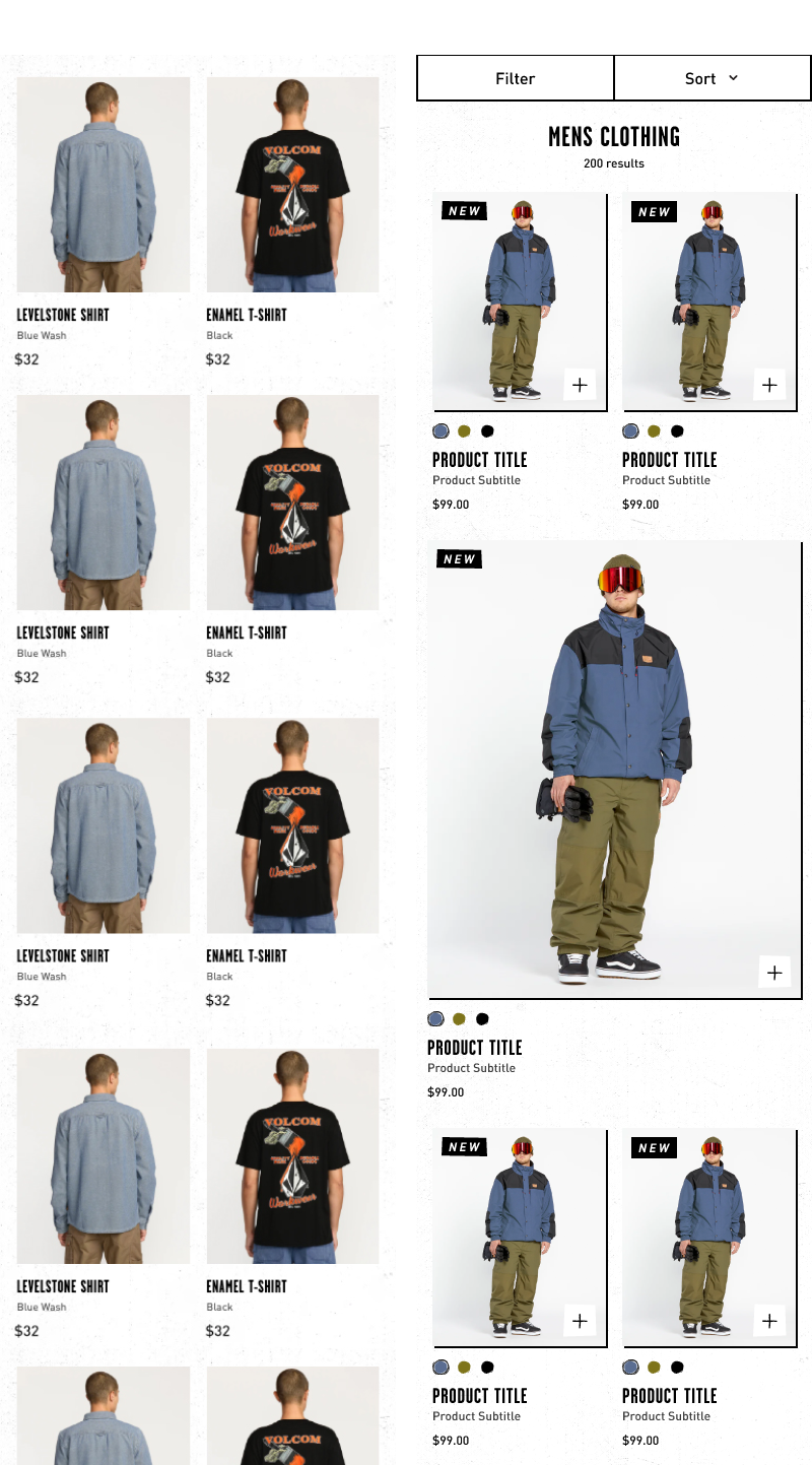
Product Landing Page (PLP) & Product Detail Page (PDP) Optimizations
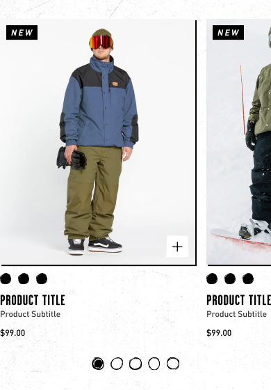
- Quick Add-to-Cart (Mobile & Desktop): Added directly to PLP grid → reduced friction, boosted AOV by enabling checkout without interrupting browsing.
- Product Sibling Colors: Clickable swatches on PLP grid → preview alternate colors instantly, reducing PDP back-and-forth.
- Full-Width Feature Tile (Mobile): Optional full-width slot → highlight or feature products, adding visual variety and focus.
- Sticky Buy Box (Desktop PDP): Persistent buy box → checkout always visible while scrolling, ensuring uninterrupted purchase flow.
Before vs After: New PLP features Quick Add, color swatches, and optional full-width product tiles.
PLP/PDP Mobile Prototype
PLP/PDP Desktop Prototype
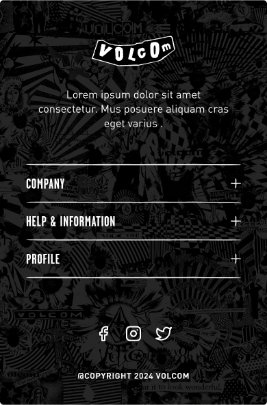
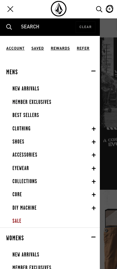
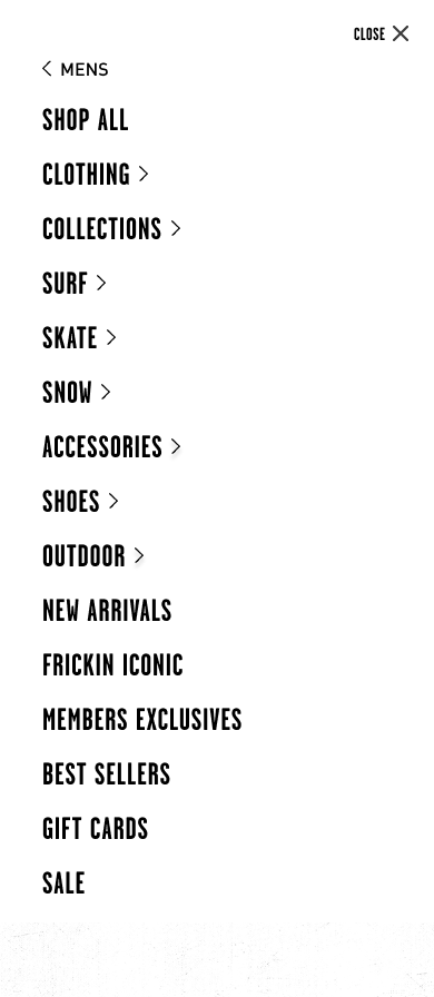
Navigation Redesign
- Pain Point: Feedback revealed mobile navigation was frustrating — small tap targets and a confusing hierarchy made browsing difficult.
- Solution: Simplified the nav structure, increased tap target size, and introduced a panel-style mobile menu.
- Impact: Improved usability, reduced friction, and made navigation more accessible across devices.
Mobile Nav Before & After
Results & Reflections
Results
- 📈 Engagement: Key content moved higher based on GA4 insights → increased visibility.
- 🖱 Usability: Simplified nav with larger tap targets → smoother browsing experience.
- 🛒 Conversion: Quick Add, hotspots, and sticky buy box → expanded conversion opportunities and boosted AOV.
- ⚡ Efficiency: Merchandisers could launch campaigns faster within Shopify CMS.
- ✅ Brand Integrity: ADA + SEO compliance preserved via live text, high-contrast layouts, and flexible type strips.
All of this was designed, prototyped, and implemented in just 1.5 months — underscoring my ability to deliver scalable, high-impact solutions under tight deadlines.
Reflections
Given the 1.5-month timeframe, I prioritized scalable, high-impact features to balance speed with long-term value. With more time, I’d build on this foundation by:
- Running usability testing of navigation patterns and sticky buy box flows.
- Conducting A/B tests on video vs. static hero banners and hotspot usage.
- Leveraging heatmaps and session recordings to observe real user behavior and guide iterative improvements.

This project solidified the value of blending brand expression, usability, and conversion strategy into one scalable system — and set the foundation for future optimization at both the design system and campaign levels.