Forage Mobile App Concept
Forage is a concept mobile app designed to help budget-conscious grocery shoppers seamlessly activate and redeem cash-back offers—without the confusion, slow timelines, or clutter of current solutions.
ROLES
UX/UI Design, Information Architecture, User Research
DELIVERABLES
Mobile app design concept
TOOLS
Figma, Miro, Adobe Illustrator
Discovery
Forage is a payments company that helps merchants accept government benefits like EBT SNAP and EBT Cash, enabling 42 million Americans to spend their benefits online and in-store.
The Problem
Grocery shoppers are overwhelmed by fragmented cashback and rewards experiences. Existing apps often require toggling between multiple platforms, hunting for offers, or manually uploading receipts — creating friction and leading to low redemption rates.
The Solution
How might we create a seamless, in-app experience that consolidates cashback opportunities, reduces friction in discovery and redemption, and ultimately helps users save more money while improving loyalty for partner brands?
Research & Insights
Competitive Analysis
I analyzed leading cashback and loyalty apps to understand where users encounter friction. While many platforms offer a wide range of deals, most struggled with:
- Offer overload without prioritization → users are shown too many irrelevant deals at once.
- Fragmented redemption flows → multiple steps or separate apps/sites are often required to claim rewards.
- Lack of integration at the moment of shopping → deals aren’t surfaced where users actually make purchase decisions.

User Needs (Personas)
- Busy Professional (Sarah, 32): Wants quick, trustworthy ways to maximize savings without extra effort.
- Parent Shopper (Luis, 41): Shops in bulk for a family; needs clarity on which offers apply to recurring purchases.
Key Insight
Users don’t just want more offers — they want confidence and clarity. Saving should feel effortless, not like managing a second job.
Ideation
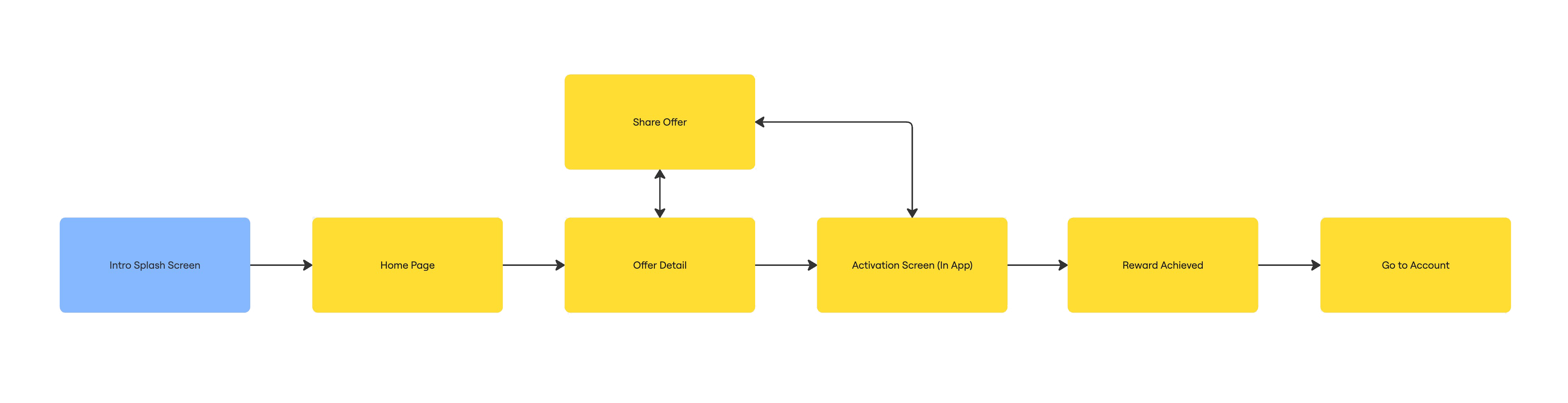
Task Flow
From launching the app to activating a cash back offer, completing a qualifying purchase, and viewing earned rewards in the user’s account.
Lo-fi Wireframes
To better understand the visual hierarchy and essential elements, I created hand-sketched wireframes outlining the must-haves for each screen.

UI Kit
I created a UI kit to translate the brand identity into a cohesive high-fidelity design system.

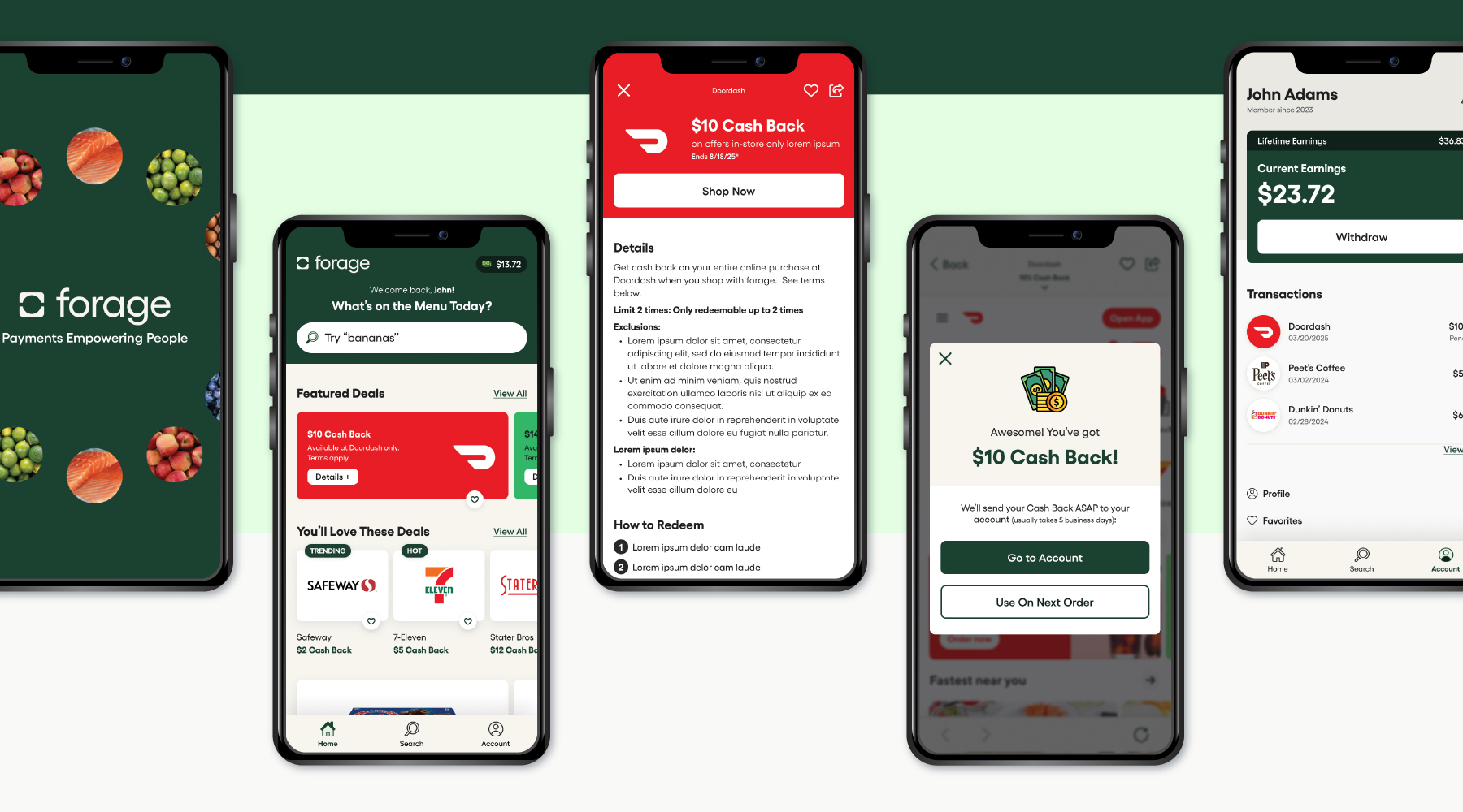
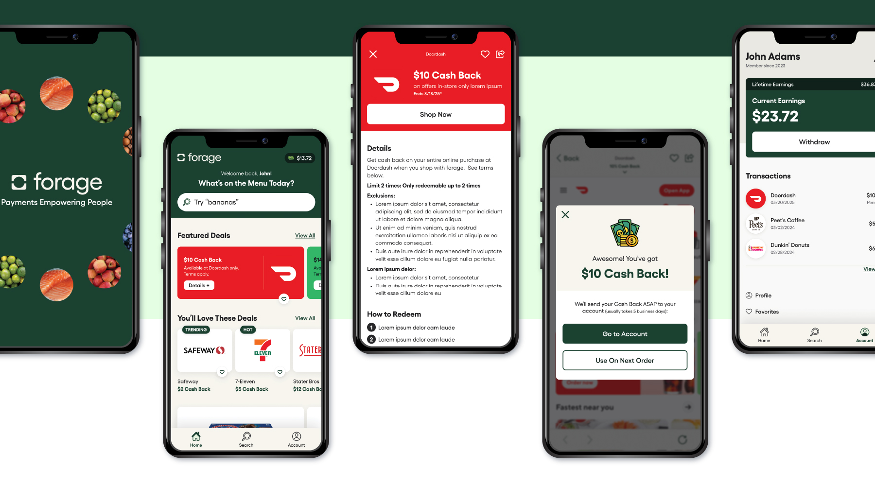
Prototype
Results & Reflections
Projected Outcomes
Since Forage is a concept project, I defined success metrics to evaluate post-launch:
- Increase redemption rates by simplifying the activation and checkout flow.
- Reduce steps to add and redeem offers, lowering friction for busy shoppers.
- Improve retention by making cashback opportunities more visible and accessible during shopping.
Learnings
- Consolidating scattered cashback tasks (searching, activating, redeeming) into a single, streamlined flow reduces user frustration and makes savings feel effortless.
- Mobile-first card layouts make it easier for users to quickly scan and prioritize offers without feeling overwhelmed.
- Reducing the number of taps required to add or redeem an offer creates a smoother experience that encourages repeat use.
Next Steps
- Run moderated and unmoderated sessions to validate if users can quickly find and activate offers with minimal friction.
- A/B Testing: Compare card vs. list formats to see which drives higher engagement and redemption rates.
- Observe if any steps can be removed or simplified further to reduce time-to-redemption.
Through this concept, I aimed to cut through the clutter of existing solutions and make earning rewards feel intuitive, trustworthy, and genuinely valuable.